
Responsive Design in Software: Creating Applications for All Devices
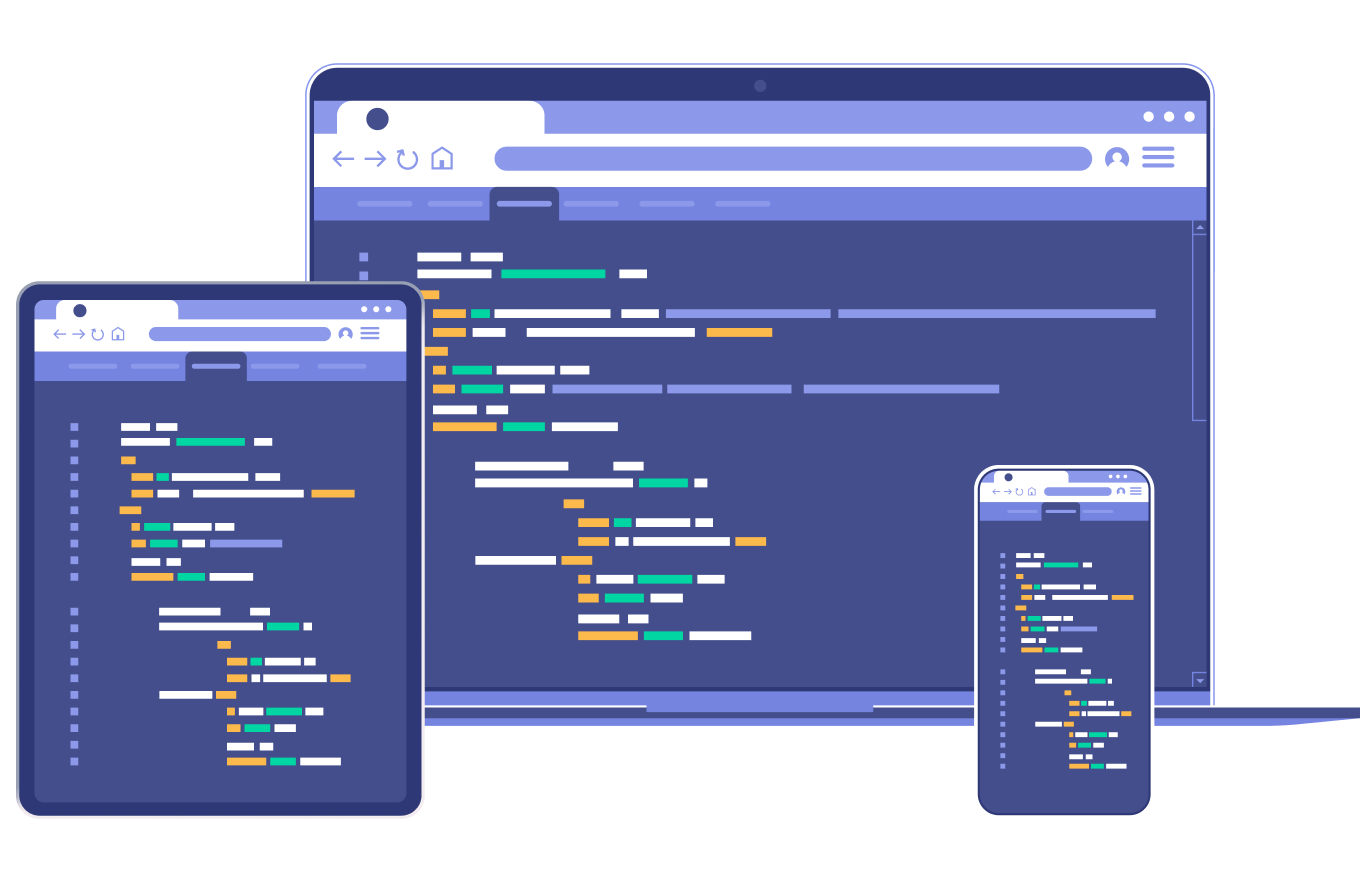
Responsive design has transformed the way software applications are developed, ensuring they function seamlessly across various devices and screen sizes. This approach is crucial in today’s digital landscape where users access applications on smartphones, tablets, laptops, and desktops.
Understanding Responsive Design
Responsive design is a design approach that aims to create applications that automatically adapt to different devices and screen sizes, providing an optimal user experience.
Fluid Grids and Flexible Layouts
Responsive design employs fluid grids and flexible layouts that use relative units like percentages rather than fixed units like pixels. This allows elements to resize proportionally to the screen size.
Media Queries and Breakpoints
Media queries are CSS techniques that apply different styles based on the device’s characteristics, such as screen width, orientation, and resolution. Breakpoints define the points at which the layout should change.
Adaptive Images and Content
Responsive design also involves using adaptive images and content, ensuring that images are appropriately scaled and content is readable on different devices.
Mobile-First Design Strategy
Mobile-first design starts with designing for mobile devices and then progressively enhances the design for larger screens. This approach prioritizes the mobile user experience.
Performance Optimization
Responsive design should also consider performance optimization, as mobile users may have limited bandwidth. Techniques like lazy loading and optimizing images contribute to a faster loading experience.
Cross-Browser Compatibility
Testing the application across different browsers and devices is essential to ensure consistent functionality and appearance.
User Experience and Accessibility
Responsive design significantly improves user experience by eliminating the need for users to zoom or scroll excessively. It also contributes to better accessibility for users with disabilities.
Challenges and Best Practices
Responsive design comes with challenges like complexity, performance considerations, and ensuring a consistent experience across devices. Adhering to best practices and keeping up with evolving technologies is key.
Future of Responsive Design
As new devices and technologies emerge, responsive design will continue to evolve to accommodate changing user behaviors and expectations.
In conclusion, responsive design is a crucial aspect of modern software development that ensures applications are user-friendly and accessible across a wide range of devices. By embracing this approach, developers create applications that cater to the diverse needs of users in today’s digital age.